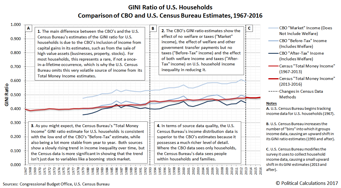
What are the differences between the Congressional Budget Office’s estimates of income inequality among U.S. households and the annual estimates produced by the U.S. Census Bureau?
We’ve taken a stab at answering that question in a visual format through the following infographic! Please click the image to access a larger, more readable version of the chart to get the quick run-down on what makes each of the indicated estimates different from one another, while also checking out over 50 years worth of U.S. household income inequality data as measured by the estimable Gini ratio.
As for Item 4, we’ll have more information soon, but as a quick indication of what we can do with the Census data that cannot be done with the CBO’s data, check out our tool What Is Your Income Percentile Ranking?
Data Sources
Congressional Budget Office. The Distribution of Household Income and Federal Taxes, 2013. [PDF Document]. Supplemental Data [Excel Spreadsheet]. June 2016.
U.S. Census Bureau. Current Population Survey. Annual Social and Economic Supplements. Historical Income Tables: Households Table H-4. Gini Ratios for Households, by Race and Hispanic Origin of Householder. All Races. [Excel Spreadsheet]. 10 August 2017.
